Lower Part of a Wheel Travels Slower

By Anupum Pant

Stick a colourful piece of paper on the side of a rim of a wheel and make the wheel roll away. If you observe carefully you’ll see, whenever the paper is near the ground, it appears clearly. However when the paper is at the top of the wheel, furthest from the ground, the paper appears hazy.

Also if you observe the spokes of a wheel of a moving cart, you’ll see that the spokes at the lower part of the wheel appear clearly. While the spokes of the upper part appear to blend into a single body, as if travelling much faster than the lower part.

It seems, the upper part of the wheel is travelling at a higher speed than the lower part of the wheel. How can that be, when both are physical extensions of a single object?

Yes, in fact the upper part does travel faster than the lower part. This sounds incredible, while it seems very ordinary to others who understand the simple physics of it. The physics involved really is very basic. So basic that I’m sure many reading this are cursing me for writing something so ordinary. But I find it really incredible. And believe me, there still are people who need to know this.

Let’s suppose the wheel moves at a speed of v in the right direction. However that is just the speed of the centre of the wheel. The upper part of the wheel for instance rotates at a speed of, say v, and also translates in the same direction at a speed of v. So, the speeds add up. And the top is travelling at a speed of 2v.

Similarly, at the bottom part of the wheel, the rotation is in the opposite direction (towards the left) and translation is in the right direction. Hence the speeds get cancelled and the lowest part of the wheel is stationary.

rims of a wheel

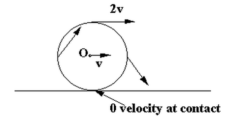
These are the topmost and bottommost points I’ve discussed here. For all the other points on the rim the rotational speed v gets split into a horizontal and a vertical component. So their speeds vary and lie in between 0 and 2v.

Some call it the cartwheel riddle.

Now, if you already knew that there’s something mind-boggling for you here. There’s another similar thing about wheels which blows my mind. Demonstrated in the video below…

The Standard World Map is Misleading

by Anupum Pant

Mercator’s projection

Most of us have this image of the world in our minds. This kind of a map, today printed in almost every textbook, known as the Mercator’s projection was first created to make work easy for navigators. Even Google Maps uses a Mercator-derived technique to project the world on a flat surface. But, Mercator’s projection has only deceived our idea of geographical area for all these years. For instance, it has led us into believing that Greenland covers an area which is almost equal to Africa (Also, have a look at the size of Antarctica there. Gosh!). The comparison of these two land masses actually looks like this.

According to this infographic, the actual size of Africa is larger than US, China, India, Mexico, Peru, France, Spain, Papua New Guinea, Sweden, Japan, Germany, Norway, Italy, New Zealand, the UK, Nepal, Bangladesh and Greece, all of them put together. In short, Africa is around 14 times larger than Greenland. Do not underestimate its area.

You can try playing with various combinations on this web app – map fight. Try these: Australia vs. Antarctica; US (contiguous) vs. Russia; and of course Greenland vs. Africa; they’ll leave you spellbound.

Why does this happen?

Since our planet is a sphere (an oblate ellipsoid really), to project it on a flat surface like paper, the actual shapes and sizes of landmasses have to be distorted to some extent. There is no way around it. Today, hundreds of different projection methods meant for various purposes are available, but none of them can exactly show the actual shapes & sizes of the landmasses. Some preserve the shape, some preserves the size, and others preserve direction…so on…

Mercator’s projection, the devious one discussed above, for example, uses a cylindrical projection. That means, it stretches the areas on a globe, which are nearer to the poles. Hence, the imprecise size of Greenland and Antarctica.

What is a perfect map, then?

Even after developing hundreds of projection method, we haven’t been able to spot the perfect method, nor will it happen in the future. But, to get the right sense of area, a projection method known as the Peters (also known as Gall-Peters projection) projection, is said to be the most accurate (in terms of area). It is also one of the most controversial maps.

Peter’s projection also has a huge fan following in spite of its terrible appearance.

Bonus Map Facts:

  1. National Geographic started using the, good looking, Robinson projection from the year 1988, and used it for ten years, then, it moved to the Winkel-Tripel in 1998.
  2. An ideal Mercator’s projection would have infinite height if it doesn’t truncate some area near the extreme poles.
  3. Peters pointed that the Mercator’s projection made developing countries seem much smaller than they actually are. He said that these errors made the struggles of developing nations near the equator looks much smaller to the developed world.
  4. XKCD published a comic on projections – “What your favorite map projection says about you.” 977. [see the explanation here]