When I first wanted to use OriginPro to make 3D plots for my Raman and photoluminescence data I struggled to find a solution for little problems for hours. It was not like I had no one to consult, but I wanted to figure it out myself because the same philosophy with learning things previously has helped me immensely in learning things with authority and developing my own characteristic style, by putting in an extra amount of time and hard work.
Check with your university, there’s a big chance that they offer you students a free copy of OriginPro. It is an amazing piece of software, easy to learn and can make plots beautiful enough to be published in Science or Nature.
However when I was toiling through things, I also wished someone who had gone through the same thing could have documented it somewhere. Not surprisingly, no one had. So I wanted to. Here it goes.
Data used for demonstration
The first thing I need to explain the kind of data I gathered, without getting too much into the proprietary stuff.
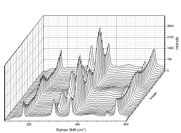
Basically, I captured a micro Raman spectra with a polarized laser incident on a crystal. In the plane perpendicular to the scope axis of the microscope, I turned the sample by 10 degrees, which as a standard for first measurement was at 0 degree and adjusted the stage every time manually to come back to the same position and measured the Raman spectrum again. This was repeated till my angle was 350 degrees.
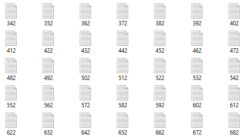
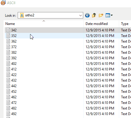
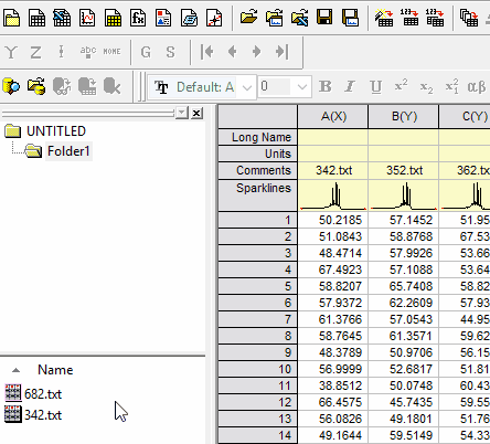
In the end, I had a folder full of 36 Raman spectra. These files all have two columns each. If line-plotted individually, they would be like the typical Raman line plot, with the first column containing x-axis (horizontal axis) values (same for all files) and the second column containing the y-axis (vertical axis) values. With 36 of these files (data) captured at respective angles (name of the file) placed in one folder looked like this.
Now for your case, this could be some other plot. Say Raman spectra with varying temperature. Or say, not even Raman, something completely different.
We will first start by setting up a filter that imports only the y-axis of the plots. This has to be done the first time, settings can be saved for later, or a new filter can be created (which will allow dragging and dropping of files).
Step 1 – Open the Import tool
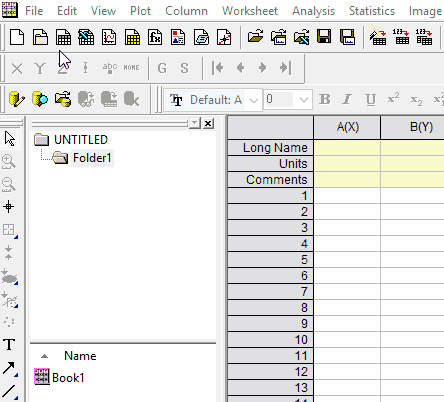
Go to File > Import > Multiple ASCII tool to start the import tool. Next, we will set it up to import only the y-axis of all the files to our sheet.
Step 2 – Select your files
This is simple, navigate to your folder and select all the files you need to plot. Assuming each of them have 2 columns – the x and y axis of a normal 2D plot. See the introduction above to understand the kind of measurement I am plotting here.
Step 3 – Set up the import filter
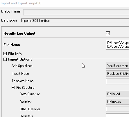
The first thing required to do is to change the Import options > import mode to “Start new columns.” This option will make the filter import new files as new columns in the worksheet. It will repeat for all the files you selected.
Second, in renaming workbook and worksheet section, check “Append filename to column comments” and uncheck “Include file path when appending filename.” This will make sure that the imported y-axis columns in your sheet will each have a tag on the top mentioning the filename. So it will be easier for you to understand which column came from which file.
Next you will need to check “Partial import” option and select the column number you would like to get imported. For that, you will change “From column” to 2. Because you want the 2nd columns to be imported from the files.
Then go to the arrow on the top left, save these settings as default, so you don’t have to do it again. And click ok.
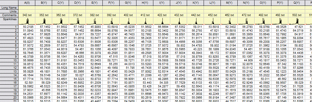
If you have a lot of files to be imported a status bar will start showing and then your sheet should get filled with columns of just y-axes from all your files. The sheet would look something like this. Note the name of the file gets appended in the comments row.
Step 4 – Get one file without the filter
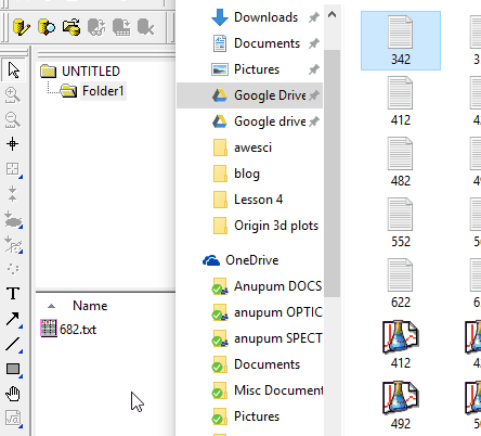
Drag and drop just one of the files from your list of all the files. In case you have filters built previously, a pop-up like this might show up. Where you would select your default filter in the program files > Originlab > Origin… folder with the name ASCII.oif. Assuming you never replaced the original filter.
But if the pop up doesn’t show up, means you do not have extra filters made. Your file should have just appeared in the left sidebar.
Step 5 – Add the column to your main sheet
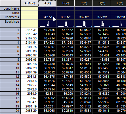
Double click your file dropped file in the sidebar to activate it. Then copy the first column (the x-axis), go back to the main sheet.
Now right-click the top of the first column and hit insert. A new empty column would get inserted on the left side of it. You will now paste your copied column here. Right click on top of the column and hit paste.
Step 6 – Designate axes for columns
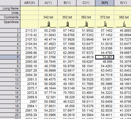
Select all the columns which are on the right side of the column you just inserted. Right click on the top, as shown, go to set as and click Y. All of these columns have now been designated as y-axes.
Similarly, select the first column, right-click the top, go to set as and select X to make it the x-axis.
Step 7 – Make the plot
To select all of the data in this sheet, click the top left corner button in your sheet (this button is empty and will show an arrow pointing bottom right as you hover on it. Once the whole sheet is selected, you can do two things to achieve the same result.
- Go to Plot > Multi-curve and select waterfall from that menu.
- Otherwise, go down to the toolbar just under the sheet, as shown in the animation above, select the arrow at the right of the 5th type of button and find waterfall plot. Click it and your plot will be ready.
Step 8 – Asthetics
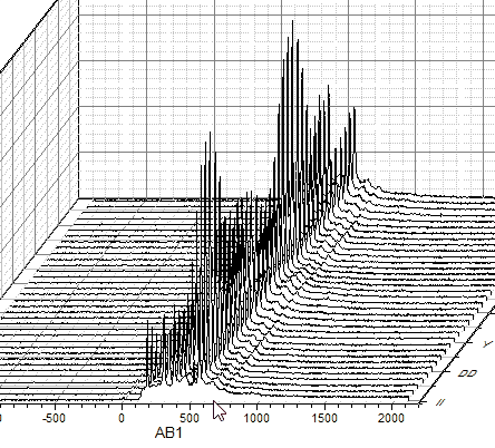
All you have to do now is take care of the aesthetics, to make your data look more beautiful. Like in the above animation I show how I first double-click the x-axis and change the range to zoom my plot to the range I want to show clearly. Then you can add label, correct tick marks and make sure that your axes have evenly and nicely placed ticks. The end product looked something like this for me.